![[Previous]](image-lib/prev.gif) |
![[Contents]](image-lib/contents.gif) |
![[Index]](image-lib/keyword_index.gif) |
![[Next]](image-lib/next.gif) |
|
|
|
|
A widget for choosing a value from a range
PtWidget --> PtBasic --> PtGauge --> PtSlider
For more information, see the diagram of the widget hierarchy.

<photon/PtSlider.h>
A PtSlider widget serves as a numerical input mechanism that allows the user to choose values within a specified range from minimum to maximum.
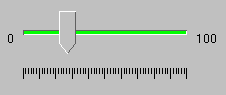
A PtSlider widget.
A slider consists of a narrow trough (representing the total range), a movable handle, and optional tick marks. The handle - which appears on top of the trough - represents the current position within the range. The size of the handle is determined by Pt_ARG_SLIDER_HANDLE_WIDTH and Pt_ARG_SLIDER_HANDLE_HEIGHT or by the size of Pt_ARG_SLIDER_IMAGE.
When the user presses the mouse button, the result depends on the location of the pointer.
| If the pointer is: | Then: |
|---|---|
| In the trough | The handle will move up or down one slider multiple |
| On the handle | A drag is started |
| If the user presses: | The handle will: |
|---|---|
| /\ | Move up one increment |
| \/ | Move down one increment |
| --> | Move right one increment |
| <-- | Move left one increment |
| Pg Up | Move up/right one "page" |
| Pg Down | Move down/left one "page" |
| Home | Move to the minimum value |
| End | Move to the maximum value |
where:
| Resource | C type | Pt type | Default |
|---|---|---|---|
| Pt_ARG_SLIDER_FLAGS | short int | Flag | See below |
| Pt_ARG_SLIDER_HANDLE_HEIGHT | short int | Scalar | 40 |
| Pt_ARG_SLIDER_HANDLE_WIDTH | short int | Scalar | 15 |
| Pt_ARG_SLIDER_IMAGE | void * | Alloc | NULL |
| Pt_ARG_SLIDER_INCREMENT | ushort_t | Scalar | 1 |
| Pt_ARG_SLIDER_LABEL_BR | char * | Alloc | NULL |
| Pt_ARG_SLIDER_LABEL_BR_COL | PgColor_t | Scalar | Pg_BLACK |
| Pt_ARG_SLIDER_LABEL_TL | char * | Alloc | NULL |
| Pt_ARG_SLIDER_LABEL_TL_COL | PgColor_t | Scalar | Pg_BLACK |
| Pt_ARG_SLIDER_MULTIPLE | ushort_t | Scalar | 0 |
| Pt_ARG_SLIDER_ORIENTATION | short | Scalar | Pt_SLIDER_MIN_ON_TOP |
| Pt_ARG_SLIDER_TICK_MAJOR_COL | PgColor_t | Scalar | Pg_BLACK |
| Pt_ARG_SLIDER_TICK_MAJOR_DIV | short int | Scalar | 10 |
| Pt_ARG_SLIDER_TICK_MAJOR_LEN | short int | Scalar | 10 |
| Pt_ARG_SLIDER_TICK_MINOR_COL | PgColor_t | Scalar | Pg_BLACK |
| Pt_ARG_SLIDER_TICK_MINOR_DIV | short int | Scalar | 0 |
| Pt_ARG_SLIDER_TICK_MINOR_LEN | short int | Scalar | 0 |
| Pt_ARG_SLIDER_TROUGH_COL | PgColor_t | Scalar | Pg_GRAY |
| Pt_ARG_SLIDER_TROUGH_SIZE | short int | Scalar | 4 |
| Pt_CB_SLIDER_MOVE | PtCallback_t * | Link | NULL |
| C type | Pt type | Default |
|---|---|---|
| short int | Flag | Pt_TICKS_ON_BOTTOM | Pt_SLIDER_POINT_DOWN |
Valid flags:
| C type | Pt type | Default |
|---|---|---|
| short int | Scalar | 40 |
The height of the slider handle.
| C type | Pt type | Default |
|---|---|---|
| short int | Scalar | 15 |
The width of the slider handle.
| C type | Pt type | Default |
|---|---|---|
| void * | Alloc | NULL |
The image that will be displayed as the handle if the Pt_ARG_SLIDER_FLAGS resource has the Pt_SLIDER_IMAGE flag set.
| C type | Pt type | Default |
|---|---|---|
| ushort_t | Scalar | 1 |
The slider increment when the cursor keys are pressed.
| C type | Pt type | Default |
|---|---|---|
| char * | Alloc | NULL |
The label string that's placed at the bottom or right of the slider, depending on the orientation.
| C type | Pt type | Default |
|---|---|---|
| PgColor_t | Scalar | Pg_BLACK |
The color of the bottom or right label.
| C type | Pt type | Default |
|---|---|---|
| char * | Alloc | NULL |
The label string that's placed at the top or left of the slider, depending on the orientation.
| C type | Pt type | Default |
|---|---|---|
| PgColor_t | Scalar | Pg_BLACK |
The color of the top or left label.
| C type | Pt type | Default |
|---|---|---|
| ushort_t | Scalar | 0 |
The slider increment when the pointer is pressed in the trough, or Pg Up or Pg Down is pressed.
| C type | Pt type | Default |
|---|---|---|
| short | Scalar | Pt_SLIDER_MIN_ON_TOP |
The location of the minimum value for the slider: on the top or bottom if the slider is vertical; on the left or right if the slider is horizontal. The possible values are:
| C type | Pt type | Default |
|---|---|---|
| PgColor_t | Scalar | Pg_BLACK |
The color of the major ticks.
| C type | Pt type | Default |
|---|---|---|
| short int | Scalar | 10 |
The number of major divisions.
| C type | Pt type | Default |
|---|---|---|
| short int | Scalar | 10 |
The length of the major ticks.
| C type | Pt type | Default |
|---|---|---|
| PgColor_t | Scalar | Pg_BLACK |
The color of the minor ticks.
| C type | Pt type | Default |
|---|---|---|
| short int | Scalar | 0 |
The number of minor divisions per major division.
| C type | Pt type | Default |
|---|---|---|
| short int | Scalar | 0 |
The length of the minor ticks.
| C type | Pt type | Default |
|---|---|---|
| PgColor_t | Scalar | Pg_GRAY |
The color of the trough.
| C type | Pt type | Default |
|---|---|---|
| short int | Scalar | 4 |
The height or width of the trough, depending on the orientation. The other dimension is obtained from the Pt_ARG_DIM resource, which is inherited from PtWidget.
| C type | Pt type | Default |
|---|---|---|
| PtCallback_t * | Link | NULL |
A list of callbacks that the slider invokes when the handle position changes.
If the widget has the Pt_CALLBACKS_ACTIVE bit set in its Pt_ARG_FLAGS resource, these callbacks are also invoked when the handle position is changed by a call to PtSetResources().
Each callback is passed a PtCallbackInfo_t structure that contains at least the following members:
These callbacks should return Pt_CONTINUE.
If the widget modifies an inherited resource, the "Default override" column indicates the new value. This modification affects any subclasses of the widget.
|
|
|
|